Applications Of Screen Printing


- Details
- Category: Screen Printing
- Published on Tuesday, 16 March 2010 03:28
- Hits: 5548
Applications Of Screen Printing
The textile industry probably makes the largest use of the screen printing technique. Screen printing is used to print on fabrics ranging from cotton and organza to silk and polyester. These fabrics are then made into finished products. The finished products include shirts, skirts, dresses, children's clothing and any kind of clothing made from printed the fabric. In fact many designers set up their own screen printing units since they are so cheap.
The designer then creates his or her own design and screen prints it in limited quantities for sale with his or her brand label. Screen printing is also used for upholstery, linen, curtains, drapes, cushion covers, bed sheets, bedcovers and other household and lifestyle requirements.
The other industry that makes extensive use of screen printing is the marketing and advertising industry. Flyers, posters, hand outs, advertisements and other point of sale or graphics products are all screen printed. The advertising industry uses screen printing primarily because it generally requires limited edition printing. The costs of printing small quantities digitally or electronically can be very high. Hence screen printing to the rescue.
The sports industry also uses screen printing to print souvenirs and collectible items. T-shirts printed with the logos of popular teams, souvenirs like caps, sweatshirts, mouse pads, keychains, baseball bats and a host of other items are all screen printed. Thus, screen printing has innumerous applications. Everywhere you look you will find examples of screen printing. Some are overt and others will be disguised.
History of screen printing
- Details
- Category: Screen Printing
- Published on Monday, 25 April 2011 02:15
- Hits: 4098
Screen printing first appeared in a recognizable form in China during the Song Dynasty (960–1279 AD). Japan and other Asian countries adopted this method of printing and advanced the craft using it in conjunction with block printing and hand applied paints.
Screen printing was largely introduced to Western Europe from Asia sometime in the late 18th century, but did not gain large acceptance or use in Europe until silk mesh was more available for trade from the east and a profitable outlet for the medium discovered.
Screen printing was first patented in England by Samuel Simon in 1907. It was originally used as a popular method to print expensive wall paper, printed on linen, silk, and other fine fabrics. Western screen printers developed reclusive, defensive and exclusionary business policies intended to keep secret their workshops' knowledge and techniques.
Early in the 1910s, several printers experimenting with photo-reactive chemicals used the well-known actinic light activated cross linking or hardening traits of potassium, sodium or ammonium Chromate and dichromate chemicals with glues and gelatin compounds. Roy Beck, Charles Peter and Edward Owens studied and experimented with chromic acid salt sensitized emulsions for photo-reactive stencils. This trio of developers would prove to revolutionize the commercial screen printing industry by introducing photo-imaged stencils to the industry, though the acceptance of this method would take many years. Commercial screen printing now uses sensitizers far safer and less toxic than bichromates. Currently there are large selections of pre-sensitized and "user mixed" sensitized emulsion chemicals for creating photo-reactive stencils.
Joseph Ulano founded the industry chemical supplier Ulano and in 1928 created a method of applying a lacquer soluble stencil material to a removable base. This stencil material was cut into shapes, the print areas removed and the remaining material adhered to mesh to create a sharp edged screen stencil.
Originally a profitable industrial technology, screen printing was eventually adopted by artists as an expressive and conveniently repeatable medium for duplication well before the 20th century. It is currently popular both in fine arts and in commercial printing, where it is commonly used to print images on Posters, T-shirts, hats, CDs, DVDs, ceramics, glass, polyethylene, polypropylene, paper, metals, and wood.
A group of artists who later formed the National Serigraphic Society coined the word Serigraphy in the 1930s to differentiate the artistic application of screen printing from the industrial use of the process. "Serigraphy" is a combination word from the Latin word "Seri" (silk) and the Greek word "graphein" (to write or draw).
The Printer's National Environmental Assistance Center says "Screenprinting is arguably the most versatile of all printing processes." Since rudimentary screenprinting materials are so affordable and readily available, it has been used frequently in underground settings and sub cultures, and the non-professional look of such DIY culture screenprints have become a significant cultural aesthetic seen on movie posters, record album covers, flyers, shirts, commercial fonts in advertising, in artwork and elsewhere.
How To Choose The Right Screen Printing Ink
- Details
- Category: Screen Printing
- Published on Thursday, 21 March 2013 01:54
- Hits: 3923
The number of different screen printing inks out there is mind boggling, but it’s really important to make sure you’re choosing the right one before you start your next printing job. There are lots of things that come in to play, the most important being what it is you’re printing on. You can’t use the same ink you use for T-shirt printing that you do make your own poster. Plus, every ink has a different effect, feel and look. But rest assured, because today I’m going to go over the screen printing ink types and help you figure out which one will work for you.
First decision, are you printing on tshirts, posters, or something else? If it’s not tshirts, skip this section.
Screen Printing Inks For T-Shirts
Plastisol Screen Printing Ink – This is the standard ink for printing on t shirts, it’s plastic based and requires high heat in order to cure. If you’re doing this at home and you don’t have a conveyor dryer, I wouldn’t suggest it because if it doesn’t get cured properly the ink will wash out, crack or peel off of the shirt and you definitely don’t want that. However, if done properly this ink will hold up for quite some time, possibly longer than the actual shirt.
Water Based Screen Printing Ink – If you want an easy to cure, fast drying, super soft feeling t shirt then this is the ink for you. Permaset Aqua offers a line of screen printing inks that are fairly cheap, but I say go big or go home. Go for what the big boys use and you won’t be disappointed. Ryonet offers a line of water based inks that are great for many uses. The other cool thing about water based inks is that you can dry and cure then with a simple heat gun like this one.
Discharge Screen Printing Ink – These inks are pretty cool. Basically how they work is when you apply the ink, it removes the color from the shirt, and replaces it with the color of the ink, which leaves the shirt feeling like it doesn’t even have ink on it. Personally I love this printing style but it’s tough to master and requires a lot of chemicals and mixing so if you’re a newbie I wouldn’t suggest it just yet. Also beware of what type of shirt you’re printing on with this method because it works best on 100% cotton and if you’re using a blend then the results might not come out how you’d expect, it’s fun to experiment, though!
Glow In The Dark Screen Printing Ink – This type of ink isn’t actually different, it’s just fun to use for some designs so I wanted to mention it. I’ve used the Speedball brand and gotten great results. Check it out right here if you’re interested.
Screen Printing Inks For Posters(or any paper products)
Water Based Screen Printing Ink – Water based inks are the best for printing on paper because they soak in and don’t require any curing, they can just air dry. This is the method I use and would suggest for anyone who wants to print their own posters or other paper products. Speedball has a great line of inks meant for paper that I highly suggest.
Screen Printing Inks For Other Stuff
Are you printing on something other than paper or fabric? You can screen print on just about anything, so the possibilities are endless. But before you try it do a little research and find out what kinds of inks are best. Check out some screen printing forums and ask for advice from the pros, it could save you a ton of money and a ton of trouble. Sometimes you won’t have to buy a completely different ink, sometimes it will only require adding something to the ink you already have, or drying it in a different way. It all depends on what you’re doing, I would attempt to write it all here but this article would be never-ending if I did that. Use Google to your advantage and you will find what you’re looking for =)
How many screen mesh counts should I use ?
- Details
- Category: Screen Printing
- Published on Thursday, 21 March 2013 01:44
- Hits: 3894
When you start out screen printing you can probably get away with using the same screen for most all of your projects but as you advance and start to demand superior quality results from your work you might want to consider using different screens with different mesh counts for different kinds of projects.Honestly, I use the same mesh count for most of my projects and the same mesh colour, 110 and white. On occasion I choose a higher mesh count for printing small text prints that I use for my labels but still that’s only 156. Otherwise, my projects are predominantly on fabric so I use a 110 mesh count on most occasions. (I once borrowed a screen from someone which was at least a 300 mesh count and I struggled my whole way through printing my work because I was using a fabric substrate - almost pulled my hair out!) But I do recognize that my readers will be experimenting with all sorts of screen printing applications so here’s a short list of what you might want to use for a specific project.
This could also help you trouble shoot if you run into problems with your print quality- you can look here to see if you are using the right mesh count. Here it is. Have fun and Good luck!
Mesh Recommendations by Application
Graphics printing
- Line artwork 230 –305
- Halftone screens up to 70 lines/in. 305–380
- Halftone screens from 70-133 lines/in. 380 –420
- Objects (plastics, etc.)
- Opaque areas 255–305
- Halftone and fine lines 305–420
Garment printing
- Glitter 25–60
- Flock adhesive 45–125
- Puff-up colors 55–125
- Overprint 80 –110
- Pigment ink printing,areas/lines 110 –175
- Plastisol transfer 125–305
- Universal fabric 125
- Plastisol direct 125–305
- Pigment inks, half-tone 155–255
- Sublimation transfer 195–305
Textiles, flat films
- Heavy décor fabrics (terry cloth, denim) 45–123
- Smooth, dense fabrics (table cloths, curtains) 110–155
- Light, porous material 195–305
Ceramics
- Glaze printing, coarse, embossed effect 15–55
- Glaze printing, medium to fine 55–155
- In and under-glaze (direct printing) 110–255
Decals
- Areas/lines 195–380
- Fine lines/half-tone 255–420
- Gold and luster inks 305–420
Glass
- Automotive glass
- Black surrounds for rear/side windows 125–195
- Antennas 195–255
- Silver paste (defroster) 195–255
Architectural glass
- Windows, doors 55–195
- Mirrors 195–305
Cosmetic bottles
- Inks 195–305
- Precious metals 305–380
Beverage
- Bottles, glasses 125–305
Household
- Ovens, etc. (masks) 110 –175
- Ovens, etc. (lines and half-tones) 195–255
- Lampshades, furniture 125–255
Advertising
- Shop signs 110 –195
Printed circuit boards
- Overlay solder mask 30 –45
- Photosensitive solder mask 60 –175
Membrane keypads and overlays
- Insulation lacquer 90 –175
- Silver conductive paste 125–175
- Adhesive 125–195
- Transparent windows 305
How to prepare artwork for screen printing ?
- Details
- Category: Screen Printing
- Published on Saturday, 05 March 2011 06:36
- Hits: 4983
A great piece of design or illustration can be taken to new heights by having it screen-printed. The texture and variance of the ink on the paper is beautiful, and the ‘happy mistakes’ are delicious. But this magic is not possible without preparing your artwork. Let’s learn how!
Introduction
This tutorial is not about creating an illustration or design.
In this tutorial I will cover the steps that need to be taken, after the artwork is completed, in-order for it to be ready for screen-printing. This is not a tutorial on the process of screen printing, if you are unfamiliar with the process please review an additional tutorial.
The basic idea is that the artwork will be separated into different layers of color, and printed one at a time. A great aspect of this process is that by overlapping the layers you can create additional colors. This tutorial showcases how I prepare, or separate, the artwork for silkscreen printing.
I should note that there are probably a million variations on this process, and everyone undoubtedly does it a little differently. I am showing how I go about it.
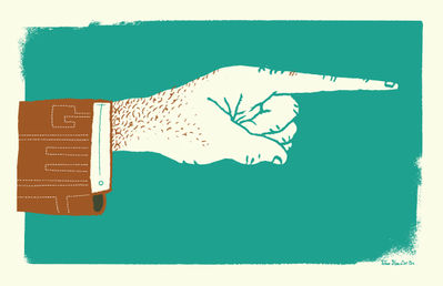
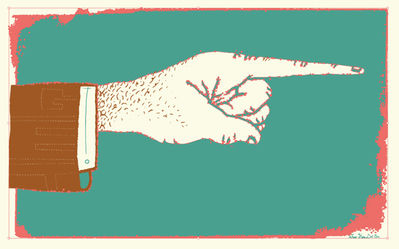
Step 1
While designing I have already thought about a few main issues. Mainly, the order the layers will be printed, and how overlaying the colors will work. For this design I kept the layering as simple as possible so that it was easy to see what I am doing.
The design will have two layers, teal and brown. First the teal layer will be printed, followed by the brown layer over the top of the teal. The shadow inside the sleeve of the mans arm is the only area of overlap. When the teal and brown overlay, it will create the dark brown color.

Step 2a
Most people probably try a few different things and have extra pieces and scrapes around a design, so first I will need to do little tidying up. While creating this design I redrew the hand and the hair letters saying “work” on the hand (in black). This will not be used, so delete it.
Step 2b
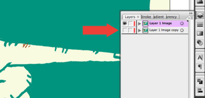
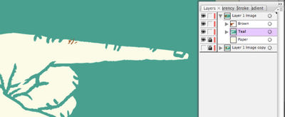
From experience I have learned to take that extra second before I start and make a copy of the entire illustration in a new layer, then hide its visibility. This is just for a backup, but I always end up using it.
Step 3
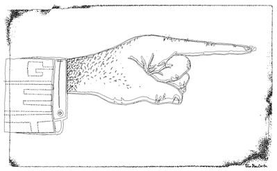
Since the design is made from so many different shapes, I like to simplifying things. Here the design is in the Outlines view mode. You can start to see that the design is made of many different shapes. This can get messy when trying to print the artwork in layers, as you need to with screen-printing. So I need to separate the colors into two layers (the brown and the teal layers) so that when the layers overlap they do not interfere with each other.
Step 4a
This next step is the basic process that will be repeated throughout this tut, so its important to understand. It will involve adding or subtracting combinations of shapes using the pathfinder palette. Suggestion: experiment with every option of this palette. It’s the easiest way to understand how it works.
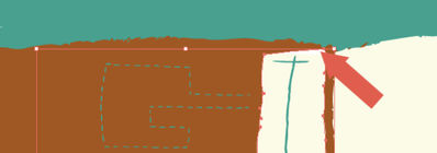
I want to combine the two shapes that make up the brown jacket sleeve (selected in red). Select both shapes.
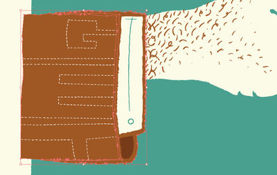
Step 4b
Click the Add To Shape Area button while holding the Option key to expand, otherwise you will have to hit the Expand button. This creates one simplified shape.
Step 5
Next I need to trim the letters of the dashed lines in the suit jacket – the word “GET,” because the shape that covered it before got lost in the previous step.Go into the backup layer (“Layer Image 1 Copy”) and select the brown shape. Copy the shape (Command + C). Switch back to the working layer and Paste the shape in-front (Command + F). Be sure to hide the backup layer and select the working layer (top layer).
Step 6
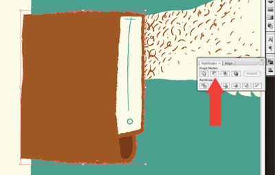
Select the dashed line shape and the brown jacket sleeve shape. Holding the option key select Subtract From Shape Area again in the pathfinder palette.
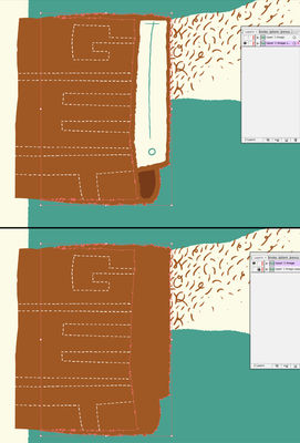
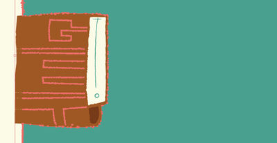
Step 7
Next move the brown shape layer (jacket sleeve and hair) layer so that it’s just above the teal background shape. I noticed there is a white shape that is not needed. Delete it.
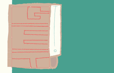
Step 8a
Select the brown jacket shape and paste a copy in back (Command + B). Select the large teal background shape and select the Subtract From Shape Area button. Obviously, you know to hold the option button or hit Expand by now so I wont mention it again.
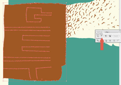
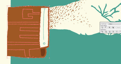
Step 8b
Now, you need to delete the dashed lines that make up the word “GET,” because it overlaps where you want the paper to show through the brown jacket shape. Enter the large teal background shape group (by Double-clicking if your in CS3) and delete the dashed lines.
Step 9
Subtract the cream shirt shape with the word “to” written in teal (the button is the “o”) in it from the brown jacket shape. Select the Subtract From Shape Area button in the pathfinder palette, while both shapes are selected. We are getting super close!
Step 10
Simply select the dark brown inside of the sleeve shape and change the color to the teal shape using the Eye Dropper Tool.
Step 11
Subtract the cream hand shape from the large teal background shape.
Step 12
Select all the teal shapes, using the Magic Wand Tool, and group them (Command + G). Do the same with the brown shapes and label that the “Brown” layer. Move the “teal” layer to the position just above the cream paper color and label the layer “Teal.” Label each layer (double-click and edit the name of the layer) and move the “brown” layer above the “teal” layer.
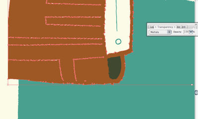
Step 13
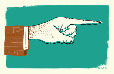
Ready to Print! Feel free to delete the “backup” layer at this point. In-order to preview how the colors will look when they are screen printed, select the brown layer, and change its blending mode to Multiply. This mimics what will happen when the brown layer is printed over the teal layer.
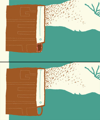
Final Image
*Disclaimer: The colors on screen may vary (sometimes drastically) from the color of the final screen print. Numerous factors can effect the color of the print, such as mixing inks by hand, color of the paper, natural light versus florescent light, etc. It is not an exact science, but it is beautiful.
The final image is below.